 Posted on 15 July 2020 by Leanne.
Welcome back to another post about one of my favorite hobbies - urban sketching! So far, we’ve gone over what urban sketching is, basic drawing techniques, advanced tips & tricks and how to add people to our drawings. I hope you’ve enjoyed practicing these things so far.
Today, I want to talk about colors, how they work together, and fun ways to use it in our sketches.
A Bit About Colour
.png)
Even if you don’t want to mix your own colors, it’s still good to know a bit about color theory. That’s right, even if you only want to use supplies that have pre-mixed colors, like markers), knowing what colors work well together, and why, can make some fun drawings!
The color wheel is the center of all this. Colors are arranged in a specific order - yellow is always next to orange, orange is always across from blue… you get the picture.
Some colors look really great when they are used side by side. There’s actually a bit of a science behind it, and we call these combinations “color relationships.” Here are three main ones:
(1).png)
Analogous: This relationship happens when three colors that are next to each other on the color wheel are used together. It’s very harmonious. Look at any three shades on the wheel - like red, to orange, to yellow-orange, and you’ll see they all work well together.
.png)
Split-complimentary: It’s when opposites attract. You can find this color combination by picking a color on the wheel, then finding its opposite. In this example above, the color we picked is green, so it’s opposite is red. Instead of using red, which could look very harsh (think of Christmas colors, how green and red look next to each other), you use the two shades that are beside red on the color wheel. So, that would be red-violet and orange-red. Green, orange-violet, and red-violet work really well together.
.png)
Triadic: this is created when you select colors that are an equal distance apart on the color wheel. In this example, that’s purple, orange, and green. They are each 3 spaces away from each other on the color wheel.
Try looking at the color wheel and making your own combinations. What do you like? What don’t you like?
Mixing Greys
A lot of artists who are just starting out with paint will only use black to make greys. While this works, it can make your art look washed out and flat. Adding straight black paint to a vibrant color like orange can make it look dirty.
If you combine two colors that are on opposite sides of the color wheel, you’re able to mix a large variety of beautiful greys.
.png)
Don’t you love this example of the color wheel made with traditional watercolor paints?
An easy way to mix a grey color is by combining two colors that are at the opposite ends of the color wheel.
.png)
This is what happens when you mix red and green together. It makes a purplish-pinkish black tone.
.png)
Yellow and purple mixed together make a warm neutral shade.
.png)
Here’s my favorite way to make grey and black - mixing blue and brown together. Think of brown as a REALLY dark orange tone. Orange is opposite of blue on the color wheel, so that’s why this works.
My go-to mix for black shades is ultramarine blue and burnt umber. This makes a cool toned grey. If I want something to be a bit warmer, you can mix cobalt blue and burnt sienna together. They are “warmer shades,” so they make a warmer neutral tone.
Shades of Grey
The possibilities really are endless with greys - here’s an amazing photo that shows what I mean!
.png)
Practice
When I first started teaching this class at the library, I had to practice some of the stuff I talked about above. I really recommend doing this with whatever materials you’re using, especially if watercolor is involved.
First, you want to make a section called “Colors in my Palette” and paint a swatch of each color you have. Don’t worry about it being pretty - you can see mine is a bit messy.
After this, use the colors in your palette to make your own color wheel.

Once you do that, you should feel a lot more comfortable with mixing colors. To get even better with it, make two more sections. One should be devoted to trying out different color combinations, like split complementary. The other should be an area where you mix your own colors together to make greys.
Great Examples
You don’t need to be a master artist to have fun using color in your sketches. Here are some examples of sketches I really liked:
.png)
This is a great way of showing that you don’t need to shade in the entire drawing to make something good.
.png)
And here - look at how cool the sky is with the bright pop of solid yellow!
.png)
You can also make some really cool drawings by using a limited color palette. This artist stuck to red and green tones - which are on opposite ends of the color wheel.
.png)
This artist mixed some really pretty neutral tones.
.png)
Look at how cool this is - a red pen line with a few thoughtful dabs of color.
Tips for Sketching In Public
Starting to draw in public can feel very intimidating. Here’s some tips that will help you:
- Don’t be scared of people!
- Don’t let yourself get bogged down by all the rules, like perspective. Keep it in mind, but if you’re paying attention to accurate lines, you will make an accurate drawing.
- Quantity is MORE IMPORTANT than quality. The more sketches you complete, the better an artist you will be.
- Wearing headphones and listening to music can really help if you’re feeling anxious while sketching in public.
- Don’t overlook your car as a drawing shelter - you can park somewhere nice and draw inside it.
- Don’t ask for permission, only forgiveness. A lot of people will actually be flattered if they realize you’re drawing them. I’ve had strangers ask to see what I’ve done and take a few pictures.
- Draw what you SEE, NOT what you know.
.png)
.png)
.png)
.png)
How I Sketch: Another Example
Here’s a sketch I made this January at the library:
.png)
I started by drawing the frame I wanted the sketch to fill.
.png)
After this, I drew in the basic shapes with pencil and started to fill them with pen. As you can see, I paid attention to a few basic lines. Where the bottom of the counter met the ceiling, what angle the top of the counter was at, and the ceiling. I also paid attention to the angle at the bottom and top of the holds shelf.
If you remember back to our quick talk about perspective, can you see the two point perspective that’s starting to be visible? I wasn’t thinking about it directly. But, (sorta) accurately drawing the view in front of me made it magically happen.
.png)
More lines, more perspective, a few details.
.png)
I had mostly filled in the shapes and started shading them with watercolor. The proportions and sizes weren’t perfect, but they worked.
.png)
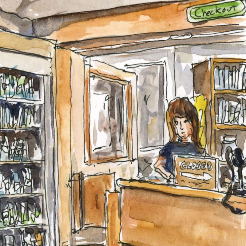
Here’s the final result. It took me about 45 minutes from start to finish. I wound up using a more limited color palette because I liked the way the browns played with the blue-toned greys and greens.
Finally, Where Do I Sketch?
If you’re just starting out, it can be easier to pick a quiet and secluded place. Parks, parking lots, and walking paths are great locations.
.png)
It’s helpful to first “frame” out the scene and figure out what you’ll draw. For me, that means I will draw the black box I want to put my sketch in. Then I’ll quickly sketch a few shapes in with pencil to work out the composition.
Think about what you want to draw. What should you focus on? Architecture? The variety of people you see at a festival? Anything goes!
.png)
Here are some great places to get started. Keep in mind, some of the locations may not be the best choice right now because of the pandemic, but they’ll be great in the future.
- Stores
- Farmers Markets
- Local Festivals
- Museums
- Parks
- Restaurants
- Cafes
- Coffee Shops
- Anywhere outside where you can set up a lawn chair or use a bench!
.png)
.png)
.png)
.png)
.png)
.png)
Homework
Draw something every day. Even if it’s a 30 second scribble.
We’re also going to try drawing something away from home. Make at least one sketch away from home. Don’t worry about how it looks or how long it takes.
Finally, practice some of the concepts we learned this week. If you’re able to, doing the exercises will help you remember them way better than if you just read them in this blog post.
***
We’d love to see what art you come up with, so please share them with us on our Facebook, Instagram, or Twitter pages. If you have any questions, feel free to email me at [email protected].
Next time, for my final post, we’ll go over all the different styles and ways you can draw things.
There’s also a small community of Urban Sketchers in Medicine Hat! They’re all very friendly people. If you’d like to share drawings with them, or get together in small groups to sketch, you can find them on Facebook and Instagram.